Melon Cutie
★★★★✩
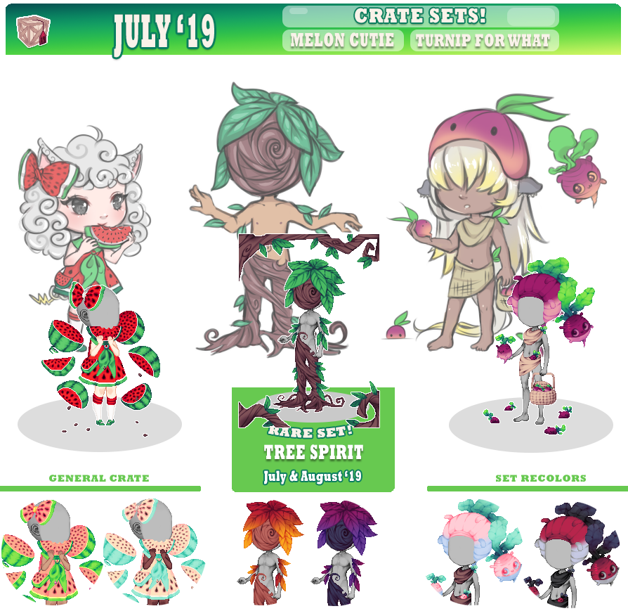
Not so much my thing with the feminine/overly cutesy style, but the mods look good and I appreciate the handheld food items. I like the watermelons in the background and I think the color choices for this one are on point. My only complaint is that aside from the hands and maybe background poses, it's not very versatile; I don't see myself having much use for it.
Turnip for What
★★✩✩✩
This one kinda confuses me. The color choices seem weird to me, and the theme of living turnips has me scratching my head, as does the big turnip hat but I'll chalk that one up to personal preference. It's not bad overall and I think the details are pretty well done, but I think more could have been done to make it stand out as a CI. There's no one pose that stands out to me on this item. That said, the basket, "skirt", and scarf top? (seems like it would have been better layering as a scarf than a top; another confusing choice) could be pretty versatile.
Tree Spirit
★★★✩✩
First off, I really enjoy the colors of this one. The gradients on the leaves look especially nice, and I think the different combinations all suit the look and theme of the item pretty well while still providing a different enough variety to keep it interesting. My favorite pose for this is the branches. Simple but effective background and border items are some of my favorite elements. The mask is an interesting choice and I like the concept of the tree trunk legs and the leaves on the body. While I also like the idea of leaf hair, the execution of this one unfortunately left a lot to be desired IMO. With so many exciting possibilities, I was really disappointed that the hairstyle just resembled every other choppy "boyish" haircut we seem to have on the site. I would have loved to see something a little more unique, and overall I felt like there was a lot of potential with this theme that was not utilized.
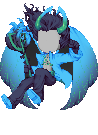
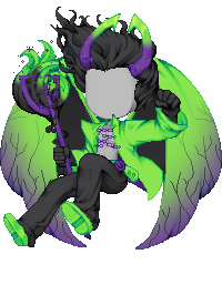
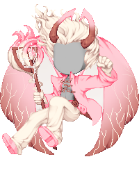
Nefarious Guard
★★★★★
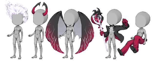
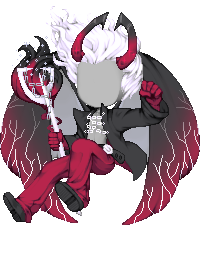
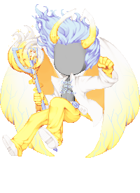
I love how versatile the poses are while still having a lot of visual impact. The color choices look great, and that hair may be my new favorite on the site. I do have a nitpick about the left foot facing a bit too far outward, and the wings looking a little "flat". I think if they'd been shaded with more folds, they'd be some very interesting wings, but as is, I don't think I'll use them much if any. My favorite pose is the jacket/arms.
1. Do the mods layer well?
Yes, haven't noticed any issues with them so far.
2. Can you match these with other items on the site?
Yes. I find color matching on this site to be pretty easy most of the time in general.
3. Should we focus on matching color schemes of previous sets?
I don't really think it's necessary. There are a lot of items in just about every color combination, and half the fun of putting together an avatar is finding ways to make a theme work more so than just having everything match in color.
4. Do you see yourself using any set in particular? What pose is most appealing to you and why do you think so?
Out of these, definitely Nefarious Guard. I like the top body mod pose and hair the best, as they feel very dynamic and aren't too similar to existing items while still having a lot of potential uses.
5. Do you like the color schemes that were picked out for these?
For the most part, I think the color choices for these sets were great. The only one I didn't care much for was the color schemes (particularly the recolors) for Turnip For What.
6. What have you seen us repeat over the months that you think we should avoid in the future months? Like a certain color scheme, a certain type of clothing or a specific mod.
I could stand to see a lot fewer dresses/skirts, tiny-footed leg mods, giant bows, and especially sleeves that hang over the hands.
7. What kind of poses/items would you like us to make in the upcoming months? Example: More hats, facial mods, holding something, etc.
We desperately need more facial feature and expression mods, and especially more facial hair. More hairstyles in general, as most of the ones we do have/get tend to look the same. I'd also really like to see more background items and more masculine and gender-neutral stuff.

