Already a Voltie? Sign in!

Escape to Voltra!

Join for free

Forums Feedback August Crate Items Feedback Thread

Npc — She/Her Posted 6 years ago ( 2018/08/1 15:44:08 )


Hey Volties!

Your feedback about last months crates was really helpful! Reading what you think could be done better really gives us a good perspective from your point of view. It helps us rethink the sets in ways we might have not considered in the beginning. We can't wait to hear what you guys have to say about this months crates.

Now we know that sometimes perhaps a set is not your cup of tea or doesn't fit your particular style, so try to look for things that we could use constructively. Like for example: If this pose was made this way and you could equip it like this then I would find use for that set more in my outfits. Or another example would be: This particular mod or pose is being repeated, I'd like to see x and y being offered as well.

★✩✩✩✩


In order to create a standard rating we will be doing a five star rating review. So for each set your reviewing do a 1/5 ; 2/5 ; 3/5 ; 4/5 ; 5/5 to let us know how much you like the overall set.

We are looking for feedback regarding the way the sets layer, originality, variety in poses, etc. But don't restrict yourself to these categories, those are just some suggestions for the direction you can take your feedback in.

We do ask that you try to keep your feedback constructive and don't just say "It looks bad, I don't like it." As it's not very useful to us.

Here is a template to start off your review:

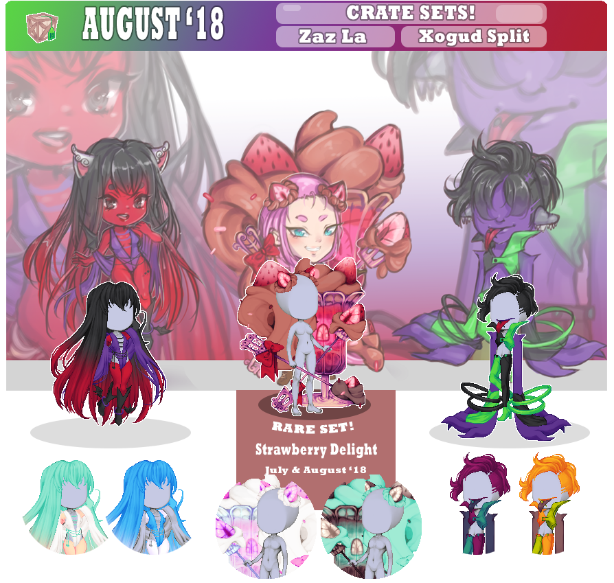
Zaz La
★✩✩✩✩

Xogud Split
★✩✩✩✩

Strawberry Delight
★✩✩✩✩

Thank you for taking your time to write this feedback, you are being very helpful!
Report

Donator — she/her Posted 6 years ago ( 2018/08/1 20:31:05 )
Zaz La
5/5
I like that there are two different arm mods. The hip wings, so cute!

Xogud Split
5/5
I love the hair!! My other favorite piece is the top. I like that it comes up a bit over the face.

It seems like the left arm should be just a hair shorter at the bottom in order to fit the perspective angle of the body. But they're cool and it won't keep me from using them.

Strawberry Delight
4/5
Its always hard to give constructive crit on artwork because there's always a real life human being artist sitting behind the art.
But it seems like if you're asking then you really do want to know. So here goes...

I adore the concept of this set. Its so clever that the strawberries and frosting (ice cream? whipped cream?) swirls are actually squirrel parts. So very cute! The color pallet is so good. The poses are each really cute and useful. The matching foreground and background are fantastic and I hope we get more of those. The hand-held spoon and fork are my favorite items. I love the bow on the fork. :vanora_heart:

There seems to be something flat about the ice cream (whipped cream, frosting?) swirly parts...like the shading needed one more layer or something. It seems to be missing the highlight layer like what shows on the concept art. All of the other pieces have a shinier, more finished look to them...the spoon, fork, and ice cream glass. I hope that doesn't hurt anyone's feelings. Overall this is such a cute set and I'm glad to have it.
Report

Voltie — sewer rat Posted 6 years ago ( 2018/08/4 06:27:58 )
Zaz La
★★★★★
that hair makes me want to cosplay sesshomaru from inuyasha tbh +1 star
+4 stars for the nicely shaded knees
...dont give me that look

Xogud Split
★★★★★★★★★★★★ XO GUD SO GUD
5 for the aesthetic and another 6 for the hair
Report

sayonara cheesecakes ( 0 ڡ≦)ゞ✩◄-gallery-►

Donator — He Posted 6 years ago ( 2018/08/6 04:13:39 )
Zaz La
★★★★✩
The hip wings & the arm mod without shawl totally the best part about the set for me
The top is actually quite awesome too

The arm mod pose with the shawl just look weird for me
Maybe because the shawl looks a lot like the hair?
Also the choice of colour of the arm make it hard to see when worn together with the hair
at first i thought the back part of the shawl is the arm mod, and the front part of the shawl is a weird hair like thing on the shoulder since i cant really see the arm lol xD

The leg mod looks quite good on female avatars, but gonna look a bit weird on male avatars tbh
Maybe because of the thigh area?

I am a bit conflicted on the hair, the back part of the hair is totally awesome o:
The front part / the bangs though ;u;
It just looks like 2 different hairstyle put together, and it doesnt look that good together
Maybe a repitition of the lower part of the hair for the bangs would be way better


Xogud Split
★★★★✩
The hair is totally awesome o:
Just like tootsie, i actually like the mouth pose, but the colour of the lip threw me off again ;u;

The leg mod & the top are nice.. But with the way that its coloured, just like the black red bearboozled, its gonna be quite hard to combine it with other items..

The arm pose is really weird for me sorry D:
From under the shoulder -> the colour change its just look too straight..
Also its kinda layered under our feet so its like we are stomping on our own hands xD
It does look awesome tho, so maybe with creativity it could be a really good pose.
Report

Donator — She/Her Posted 6 years ago ( 2018/08/21 22:41:47 )
Millet, spilling the tea:

Zaz La
★★★★★
A solid item with a Succubus design that many people would quest for on practically any avatar based site.
I do kinda wish the arms were posed just slightly different as they practically blend in with the hair (as well as other hairs)
and just look armless rather than a sultry pose (unless you wear contrasting colors like my current avi)

Xogud Split
★★✩✩✩
I agree with others that while I like the concept of the mouth, it feels slightly out of place or colored odd
where it looks like a plastic piece added to the face rather than an actual mouth with more cartoony characteristics.
I think also the clothing could have benefited more greatly with extra added textures. The flatness of some of the parts
of the clothes (just solid color no shading and such) again give me the "plastic" vibe. (just me?)

Strawberry Delight
★★★★✩
The coloring is beautiful, especially of the pudding dessert in the background.
This is a set that would go amazing with the sweet treats crate from way back.
The only part I really don't like is the ...squirrel tail pudding thing? Similar to the xogud critique,
it doesn't have enough (to me) texture or shading so it looks less like a tail to me and more like a brown plastic
blob in the back with a strawberry. It also just looks slightly conflicting (to me) when compared to the heavy detail of all the
other parts. Legit just a bit more shading in the crevices would have made a world of a difference (for me)
Report


You must be logged in to post

Login now to reply
Don't have an account? Sign up for free!
Having you as a Voltie would be awesome.